Vida Nova Recovery Launches New Brand Identity
Vida Nova Recovery has officially launched a new brand identity designed to reflect the organization’s approach to recovery, renewal, and new beginnings.
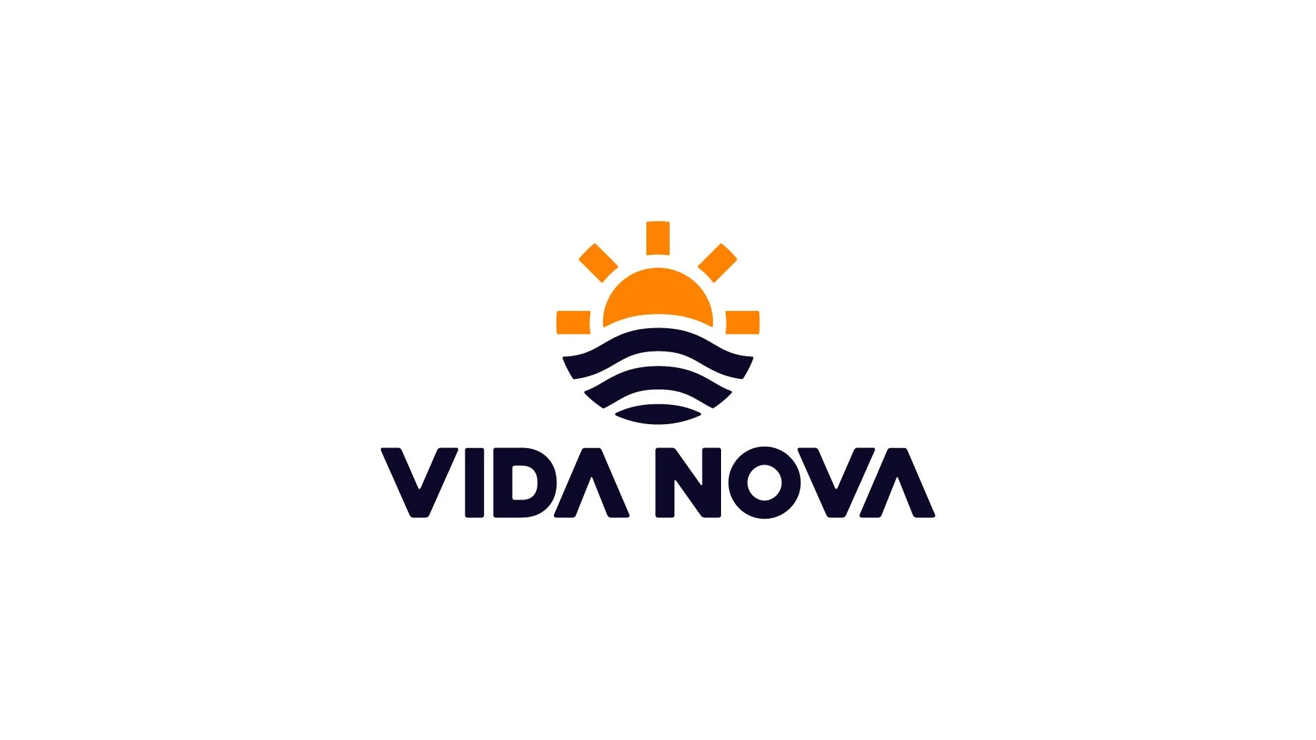
The name Vida Nova means “new life,” a meaning that helped guide the direction of the new brand. Inspired by the sunrise along Newfoundland’s coastline, the logo and visual identity were created to represent hope, change, and the beginning of a new chapter.
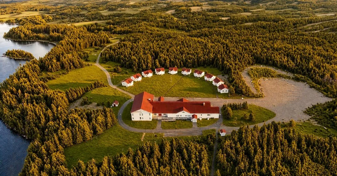
The design also draws from the natural surroundings of the property in the Salmonier Valley, including the nearby water and the architecture of the facility itself. A semicircle of cottages on the property helped inspire the logo’s radiating sun rays, tying the visual identity directly to the space where recovery takes place.
“Our goal was to create something that felt reassuring and optimistic,” said the Vida Nova Recovery Founder Ryan Kirby. “Recovery is about moving forward, and we wanted the brand to reflect that feeling in a simple and meaningful way.”
The refreshed identity includes a modern geometric icon, updated typography, and a calm, uplifting colour palette that will be used across the organization’s website, signage, and communications.
The new brand marks an important step as Vida Nova Recovery continues to grow and create a welcoming space for people seeking recovery and support in Newfoundland and Labrador.